Zum Inhalt springen


I’m Li, a digital designer.
I develop visual systems strategically.

I’m a UX/UI designer based in Germany, solving problems at the intersection of human cognition and digital design. For the past decade, I’ve helped organizations communicate their products and mission -> from visual to web, UX/UI design and front-end development.

Curious to collaborate? Let’s chat!
-> li.daniel@protonmail.com

MORE INFO

BACKGROUND

PortUNA Neue MedienUX/UI design
front-end development

Intranet programming department
06/202304/2024 FT
RBB – Rundfunk Berlin-Brandenburgproduction assistance

Radio COSMO
01-04/2021 FT
SWFRproject management

International Club
german-asian project team
11/2018-10/2020 PT
Kunstverein Freiburgtechnical support
art handling
artistic assistance
11/2017-10/2020 PT

EDUCATION

FIGD Academy for IT and Graphic Design certification as 3D Specialist 08-11/2022 FT
FIGD Academy for IT and Graphic Design certification as UX/UI Designer08/2021-08/2022 FT
LIMA Berlincertification in Photoshop – advanced04/2017
Albert-Ludwigs University Freiburg BA Sinology & Cognitive Science10/2014-02/2021

internships

MERICS – Mercator Institute for China Studies Berlininternship

communication department
10-12/2020 FT
Roberto Sandino (Granada NI)internship

analog print workshop – La Sirena
03-04/2016 FT
Gabriella Stellino (Riegel DE)internship

independent illustration office
11/2014-04/2015 PT

concept, strategy & management

Impuls Crewco-founding
project management
visual design
01/2020-10/2020
Subtil/Skurrilco-founding
management
visual design
05/2017-10/2023
Movement Motus e.V.co-founding
executive board membership
project management
visual design
12/2015-01/2020

selected projects

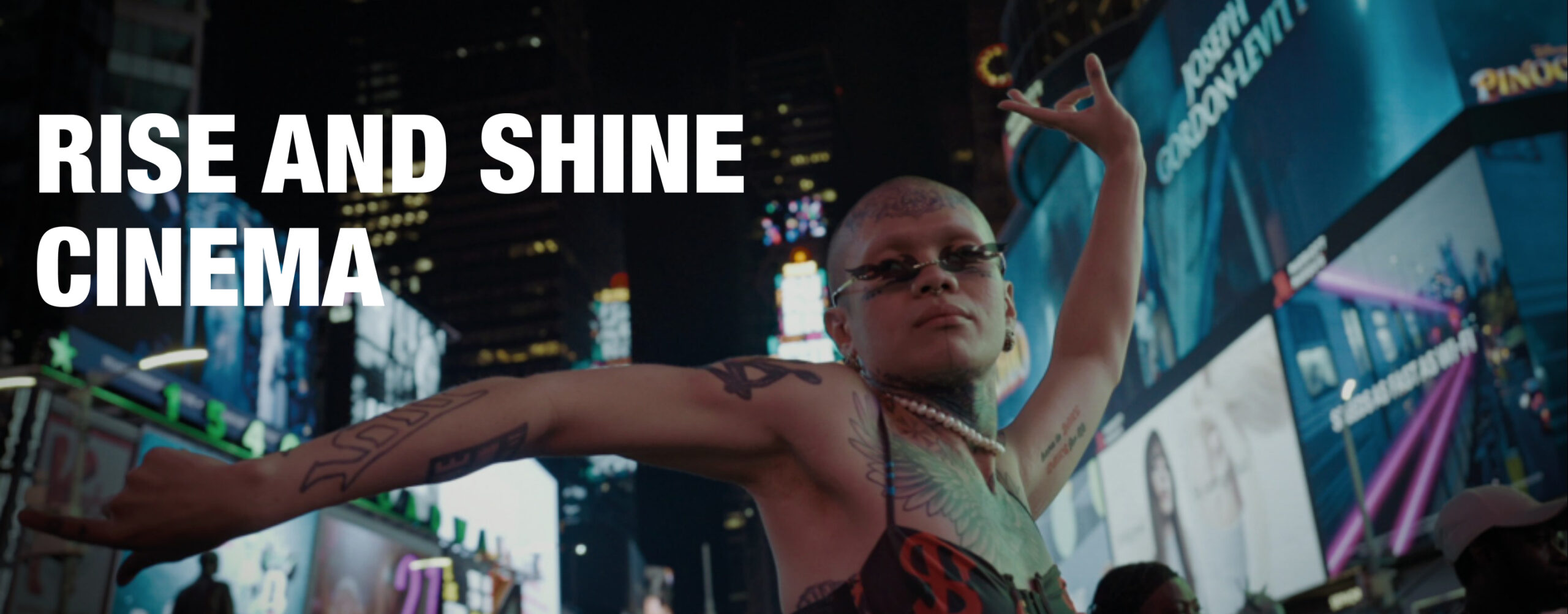
RISE AND SHINE CINEMA

Website UX Redesign 05/2026

My role: UX research, IA, UI design, web development

[WordPress, PHP, CSS]

Film distributor RISE AND SHINE CINEMA commissioned a comprehensive redesign of its website to resolve critical usability issues affecting both external users and internal staff. Through an extensive redesign the project aimed to create a more enjoyable and efficient experience for everyone interacting with it.

READ THE CASE STUDY

About the client: RISE AND SHINE CINEMA is a German film distributor specializing in award-winning documentaries, releasing an average of four films per year. Founded in 2015, the company is the German distribution arm of RISE AND SHINE WORLD SALES, an international film sales agency established in 2008.

Goal

RISE AND SHINE CINEMA distributes acclaimed documentaries reaching German audiences – but their website, the first point of contact for press, cinema programmers, and curious viewers – failed to represent the quality of their products adequately. Incoherent UI and aesthetic, in combination with a lack of system integrity lead to an unsatisfying, sometimes even frustrating user experience, that undermined the company’s credibility massively.

This project was a full rebuild: new information architecture, new design system, and several custom-coded solutions provide a seamless user experience now, aligned with RISE AND SHINE CINEMA’s brand and business needs.

Problem Analysis & Key UX Insights

The discovery phase was grounded in a hands-on website audit with a member of the internal team, who regularly works with the existing website. Together, we went through the site systematically, documenting pain points as we encountered them across each section: homepage, film pages, navigation, and so on. This produced a raw inventory of issues tied to specific locations on the site, which was then reorganized thematically – revealing three recurring problem clusters: information architecture, visual design, and system integrity. These insights formed the foundation for the redesign strategy.

AspectKey IssuesImpact
Information ArchitectureInconsistently duplicated content, fragmented structure, non-intuitive menuDifficult content discovery, high cognitive load, maintenance overhead
Visual DesignInconsistent UI patterns, weak hierarchy, outdated aesthetics, scroll-heavy pages, dysfunctional media elementsReduced trust, poor scannability, interrupted content consumption weak brand perception
System IntegrityDead links, broken video playbackBreaks user flows, reduces perceived reliability

Information Architecture Issues

The site suffered from an inefficient information architecture, with inconsistently duplicated film representations spread across multiple categories. Combined with a non-intuitive navigation structure, this made content discovery difficult for visitors, increased cognitive load, and added unnecessary maintenance overhead for internal teams.

Design Inconsistency

Outdated visual styling, inconsistent UI patterns, and weak spacing logic reduced overall design coherence, making it difficult for users to scan content and maintain orientation across the experience.

Poor System Integrity

Broken video playback and dead links disrupted key user flows and undermined the perceived reliability of the website – particularly damaging in a media-driven context where access to (moving) images is central to the experience.

Design Approach

Given the scale of structural issues identified during the analysis, an incremental redesign was not considered viable. Instead, I rebuilt the website from the ground up in a staging environment.

The project was developed iteratively with the client’s internal contact, who reviewed structural and design decisions throughout the process rather than only at handover. This running feedback loop surfaced concerns early and confirmed before launch that the new structure matched how the team actually thought about and used the site.

Information Architecture

To eliminate inconsistently duplicated content and reduce maintenance overhead, I consolidated each film into a single dedicated page.

I also restructured the navigation to improve clarity and wayfinding across the site.

Visual Design

I developed a new design system to establish visual consistency and improve usability across the platform.

The redesign of the page layouts places a lot of emphasis on consistency, scannability and usability.

System Integrity

Where possible, I updated defect links to reflect current destinations. Remaining dead links were removed.

I identified broken video playback as a critical issue that could not be resolved within the scope of the project, as it required changes to the client’s video privacy settings. The client acknowledged responsibility for the fix.

Redesign

Information Architecture & Navigation

The previous website contained inconsistent duplicate pages, which meant that many films were represented by two separate pages with different content and designs. This was because the categories (KINO and VOD/DVD) were treated as different datasets rather than filters.

This not only confused visitors navigating between sections, but created a significant maintenance burden for internal staff, who had to update each duplicate separately.

Consolidating everything into a single dedicated page per film resolved both problems: a cleaner experience for visitors, and a more efficient maintenance system for the team.

Before: film page in KINO category

Before: film page in VOD / DVD category

-> Redesign: one page per film in a consistent layout

I reduced navigation to 3 items (KINO, STREAM, and ABOUT) because the audit revealed users had to click through 6 options with no clear mental model separating them.

The two categories: KINO and STREAM, allow the films to be presented within a clear, filterable overview. I moved recurring actions and information (newsletter subscription, contact details, privacy policy, imprint and social media links) into a persistent footer available throughout the site, since they need to be easily accesible but shouldn’t take up to much attention in the UI.

Before: navigation overlay expands on click, offering 6 options

-> Redesign: prominent navbar on top with 3 clear options

-> Redesign: newsletter subscription, contact details, privacy policy, imprint and social media links moved to footer

Visual Design

Homepage

The modernized homepages first impression is set by a hero section presenting high-resolution film stills within a dynamic slideshow to create an emotional connection to the sites content.

Dedicated preview sections (KOMMENDE FILME, FILME ZUM STREAMEN) guide visitors toward the two core categories (KINO and STREAM), inviting users into the catalogue.

The featured section (DERZEIT IM KINO) highlights the film currently in cinemas, reinforcing the company’s offline presence – an important signal given that cinema releases remain central to their business model alongside streaming.

Before: homepage is the same as the KINO category overview

-> Redesign: homepage with hero section, category previews and featured section

Category Overviews

Less is more

The old website contained 3 category overviews to filter content pages: Kino – containing all films, VOD (video on demand / stream) and DVD (for films availiable on DVD).

I removed the DVD section completely because the audit revealed that the company was not generating meaningful direct revenue from DVD sales through the site, making the section an outdated remnant that added structural complexity without business value. Its removal simplifies both the navigation structure and the overall content architecture.

Film stills vs. posters as preview cards

An early debate during the project concerned the visual treatment of film preview cards.

My initial proposal was to use film stills rather than posters – a choice grounded in competitor research across the film distribution landscape with similar target groups. A review of comparable international companies (Modern Films, MUBI, Constantin, Pandora, A24 and Arthaus) revealed a consistent pattern: distribution and production companies use film stills to preview their titles editorially to sell screening rights to cinemas and streaming platforms, while cinemas – whose role is ticket sales – lean on posters. That is why, in my opinion, film stills feel more in line with the aesthetic language of an arthouse audience. The management team disagreed, arguing that consistent poster display would strengthen the individual branding of each film.

The compromise I proposed resolved both positions: film posters are used on the KINO category overview (targeting cinema programmers), while film stills appear in the STREAM section (targeting end consumers). Beyond settling the aesthetic debate, this distinction also serves a wayfinding function – giving users a clear visual signal about which section they’re browsing.

To implement this in WordPress, I wrote a PHP script that automatically pulls the poster from each film page and uses it as the section-specific preview image, keeping the system low-maintenance while supporting two visually distinct category experiences.

Streaming links supporting sales

During one of the design iterations, my contact at the company and I landed on an idea: rather than having the STREAM overview mirror the KINO section with a different filter, its preview cards could link directly to the respective streaming platform instead of to the film’s internal page. This reduces the steps between discovery and viewing, and gives STREAM a distinct purpose – where KINO works as a catalogue, STREAM becomes a direct gateway to watching.

For this I inserted a custom field to the film page template: when a film is marked as streamable in the CMS, the field is added automatically to store the external link. A PHP script then reads it and assigns it as the destination for that film’s preview card in the STREAM overview, routing users straight to the platform rather than back into the site.

The client was particularly appreciative of these custom-coded solutions, which allowed the site to behave in ways the standard CMS setup wouldn’t have supported out of the box.

Before: VOD category overview

Before: DVD category overview

-> Redesign: KINO category overview (for all films) leading to respective filmpages on the website

-> Redesign: STREAM category overview (streaming availiable films) leading to the respective streaming-pages

Film Pages

To create a predictable and user-friendly browsing experience, all film pages use a standardized and consistent layout structure with clear information hierarchy, and on page navigation.

Each film page opens with a film still that immediately communicates the title, visual identity and tone of the film. Key information is presented at the beginning of the page, followed by quick-access navigation links to important sections such as the trailer, screening dates, press kit, and reviews. These shortcuts reduce excessive scrolling and enable visitors to access relevant information more efficiently. To reduce scrolltime further, additional information for the film about world premiere, festivals + awards, cinema release dates and press reviews are summarized in an expandable detail-section after exceeding 3 list-entries (MEHR). Where available, direct links to streaming platforms are integrated into the quick-access navigation, making digital viewing options immediately visible and accessible.

Before: scroll-intense film page with unclear hierarchy, dysfunctional slideshows and nested page sections

-> Redesign: film page with consistent layout, clear information hierarchy and quick-acess links for on page navigation

Outcome


The new website, with its intuitive navigation, consistent design and modern aesthetic, invites users to explore the content and mission of RISE AND SHINE CINEMA in an efficient manner. Beyond solving the immediate issues, the new site is both aesthetically future-proof and structurally built to scale with future releases.

The client responded positively not just to the design, but to the process – the iterative collaboration and my effords to onboard the team on the new system. Structurally, the redesign eliminated 30 duplicate film pages, removing a recurring maintenance burden for internal staff. The custom-coded solutions gave the site capabilities beyond standard WordPress, which the client specifically valued.

Two items remain before official launch: the video playback fix, which depends on a change to the client’s video privacy settings, and final data population on the client’s end ahead of connecting the new site to the existing domain.


menopause.film

Web Design & Development 10/2025

My role: UI design, web development

[WordPress, JS, HTML, CSS]

MY NEW OLD SELF – a documentary by Louise Unmack Kjeldsen – required a website ahead of its release: a bilingual platform to establish credibility and serve as a first point of contact for press and cooperation partners.
READ THE CASE STUDY

See the RISE AND SHINE CINEMA case study for full client background.

Goal

The client defined the initial scope through a small conceptual backlog:

Primary purpose of the site

-> establish credibility and serve as an information hub for press and cooperation partners

Content required at launch

-> synopsis, vision & mission, team, teaser images, protagonists, contact

Content planned for later phases

-> trailer, festival information, screening kit download, press reviews, social feed integration

Language requirements

-> bilingual (English/German)

From this, I derived following key user requirements:

Users need quick access to essential information.
The site must offer a clear and easily scannable overview.
The experience should invite users to explore the project behind the scenes.

Challenges

Conceptual: keeping an informative website engaging while addressing sensitive subject matter.

Aesthetic: narrating the story behind the film with emotional impact, without clichés or spoilers.

Technical: providing two languages efficiently across the site.

Design Decisions

A minimal interface with a consistent layout ensures fast orientation and easy access to content.

Visual and structural elements subtly invite users to explore behind-the-scenes material.

A prominent language switcher – labeled in each language’s native form – supports English and German audiences from the start.


SHOOT N‘ SHRINK

Game Development Contest 08/2024

My role: game design, game art, visual & UI design

[Blender, Adobe PS, Unity, Git]

Shoot and shrink your way through your enemies in this high paced top down shooter! Contribution for the GMTK Gamejam. Submitted on itch.io, 1 hour, 57 minutes before the deadline. Gameplay: break your enemies plasma shields and use your shrink gun to shrink them down to size so you can eat them.
READ THE CASE STUDY

Goal

The GMTK Game Jam is one of the largest game jams worldwide, bringing together thousands of developers to create a game within a strict 96-hour timeframe. The 2024 theme, “BUILT TO SCALE” challenged 32000 participants to explore scale in creative ways.

Our initial concept focused on swarm behavior. We aimed to design a system of small, hand-animated microorganism-like entities – similar to amoebae – that would move as a clustered group through space. We called them Nanobots. The idea was to let players push, pull, and guide these organisms to interact with the environment, potentially solving puzzles or engaging in destruction-based gameplay. A clustering algorithm was planned to drive this emergent behavior.

Research

While the technical exploration progressed, the concept revealed critical UX issues early on. The visual result lacked clarity, and the interaction model failed to produce engaging or intuitive gameplay. More importantly, we were unable to define a satisfying core loop – an essential foundation for user experience.

At the halfway point (after ~48 hours), I initiated a strategic pivot. With limited time remaining, we shifted our focus from innovation to clarity, playability, and completion. Our new goal became: deliver a small, coherent, and polished experience.

Insight: In difficult situations, we need to adapt our strategy. Developing this ability is a learning process for the team.

Design Approach

We transitioned to a straightforward top-down shooter in 2½D. In this redesigned concept, the player controls a mysterious character shrinking enemies in an abandoned spaceship – tying back to the theme of the gamejam.

From a UX/UI perspective, this pivot allowed us to:

  • Establish a clear gameplay loop (shoot -> shrink -> eliminate)
  • Improve visual readability and player feedback
  • Reduce cognitive load and ambiguity in interactions
  • Focus on responsive controls and satisfying moment-to-moment gameplay

The project was developed in Unity, with version control managed via Git on a private server. I was responsible for visual design and asset creation in Blender, integrating and refining them within the engine.

Outcome

While not at the top, the result reflects a successful recovery from an initially over-scoped concept to an exciting, playable experience. The project demonstrates pragmatic decision-making and a user-centered approach under extreme time constraints.

Out of 7527 submitted games, ours ranked: Overall #3689 and #3200 in the Enjoyment criteria (based on 21 ratings)

A standout moment was the integration of the soundtrack, which significantly enhanced the overall user experience – elevating emotional engagement beyond expectations.


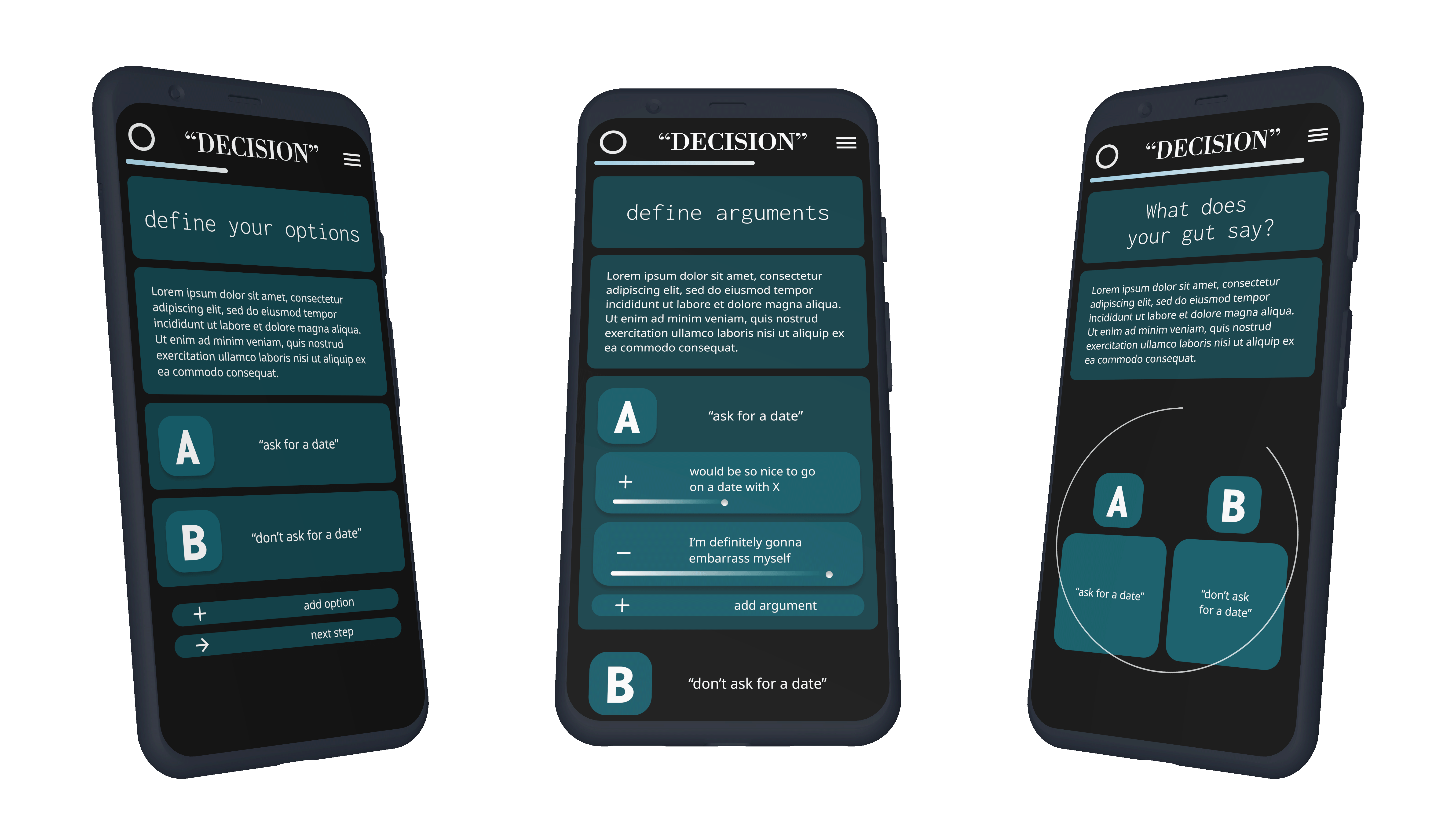
THE DECIDER

App Design 07/2022

My role: product design, UI design

[Figma]


Decision Support System, working as thought-reflection interface. Designed to help users discover their true opinion by supporting rational thinking and enhancing intuition.

-> READ THE CASE STUDY with password


SUBTIL/SKURRIL

Brand & Web Design 2017–2023

My role: co-founding, management, branding, visual & UI design, web development

[WordPress, Adobe PS, Adobe Illustrator]


SUBTIL/SKURRIL is a digital platform for art and literature, founded in 2017 by Fluvius Raon and myself. Conceived as a hybrid between a webzine and an online exhibition space, it serves as a curated environment for inspiration, exploration, and creative collaboration. The visual identity balances abstraction and clarity, reflecting the core concept of Subtil/Skurril – a dynamic interplay between the subtle and the unconventional.

BROWSE SUBTIL/SKURRIL HERE